 #ref-menu
 Responsive Web Design - Media Queries
 |
tamhoangdk - Cấp bậc:  |
 17-04-2016
Media Query là gì?
Nó sử dụng các quy tắc @media để bao gồm một khối thuộc tính CSS
Ví dụ:
Thay đổi kích thước cửa sổ trình duyệt. Khi chiều rộng của tài liệu này là ít hơn 500px , màu nền là "lightblue", nếu không nó là "lightgreen".
Test online: http://www.w3schools.com/css/tryit.asp?filename=tryresponsive_mediaquery
Thêm một breakpoint:
desktop

phone
Test online: http://www.w3schools.com/css/tryit.asp?filename=tryresponsive_breakpoints
Nó sử dụng các quy tắc @media để bao gồm một khối thuộc tính CSS
Ví dụ:
Thay đổi kích thước cửa sổ trình duyệt. Khi chiều rộng của tài liệu này là ít hơn 500px , màu nền là "lightblue", nếu không nó là "lightgreen".
<style>
body {
background-color:lightgreen;
}
@media only screen and (max-width: 1000px) {
body {
background-color:lightblue;
}
}
</style>
<p>Nội dung </p>
Copy code
body {
background-color:lightgreen;
}
@media only screen and (max-width: 1000px) {
body {
background-color:lightblue;
}
}
</style>
<p>Nội dung </p>
Copy code
Test online: http://www.w3schools.com/css/tryit.asp?filename=tryresponsive_mediaquery
Thêm một breakpoint:
desktop
phone
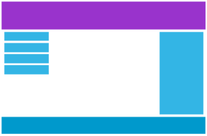
<style>
* {
box-sizing: border-box;
}
.row:after {
content: "";
clear: both;
display: block;
}
[class*="col-"] {
float: left;
padding: 15px;
}
html {
font-family: "Lucida Sans", sans-serif;
}
.header {
background-color: #9933cc;
color: #ffffff;
padding: 15px;
}
.menu ul {
list-style-type: none;
margin: 0;
padding: 0;
}
.menu li {
padding: 8px;
margin-bottom: 7px;
background-color :#33b5e5;
color: #ffffff;
box-shadow: 0 1px 3px rgba(0,0,0,0.12), 0 1px 2px rgba(0,0,0,0.24);
}
.menu li:hover {
background-color: #0099cc;
}
.aside {
background-color: #33b5e5;
padding: 15px;
color: #ffffff;
text-align: center;
font-size: 14px;
box-shadow: 0 1px 3px rgba(0,0,0,0.12), 0 1px 2px rgba(0,0,0,0.24);
}
.footer {
background-color: #0099cc;
color: #ffffff;
text-align: center;
font-size: 12px;
padding: 15px;
}
/* For desktop: */
.col-1 {width: 8.33%;}
.col-2 {width: 16.66%;}
.col-3 {width: 25%;}
.col-4 {width: 33.33%;}
.col-5 {width: 41.66%;}
.col-6 {width: 50%;}
.col-7 {width: 58.33%;}
.col-8 {width: 66.66%;}
.col-9 {width: 75%;}
.col-10 {width: 83.33%;}
.col-11 {width: 91.66%;}
.col-12 {width: 100%;}
@media only screen and (max-width: 768px) {
/* For mobile phones: */
[class*="col-"] {
width: 100%;
}
}
</style>
<div class="header">
<h1>Chania</h1>
</div>
<div class="row">
<div class="col-3 menu">
<ul>
<li>The Flight</li>
<li>The City</li>
<li>The Island</li>
<li>The Food</li>
</ul>
</div>
<div class="col-6">
<h1>The City</h1>
<p>Chania is the capital of the Chania region on the island of Crete. The city can be divided in two parts, the old town and the modern city.</p>
</div>
<div class="col-3 right">
<div class="aside">
<h2>What?</h2>
<p>Chania is a city on the island of Crete.</p>
<h2>Where?</h2>
<p>Crete is a Greek island in the Mediterranean Sea.</p>
<h2>How?</h2>
<p>You can reach Chania airport from all over Europe.</p>
</div>
</div>
</div>
<div class="footer">
<p>Resize the browser window to see how the content respond to the resizing.</p>
</div>
Copy code
Test online: http://www.w3schools.com/css/tryit.asp?filename=tryresponsive_breakpoints
 Tổng số: 1
| - Share: BBCode: Link: |